Sunday, February 28, 2010

Assignment 3 - Photo Story Narrative

This time, I shall let the pictures do the story telling. Perhaps it is a thousand times better than my sketch. >.<


Do you know what I'm trying to show now?

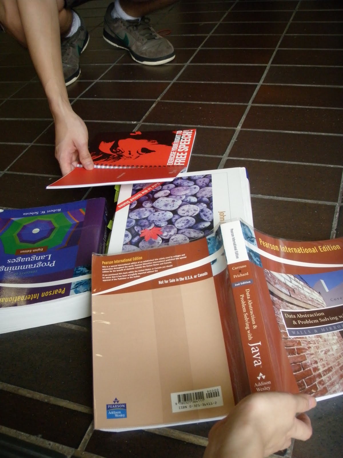
Basically, this photo story is about this girl who fell and her books scattered all over the floor. Just then, a guy came to help her out and they hit it off as friends immediately.

The girl excitedly introduced her new found friend to her friends and wanted them to take a photo for them. However, in reality, her friends didn't see anyone there. So they were quite confused when she was all excited and hyped up. But they went along and took a picture for her. Turns out, when the picture is developed, there really isn't anyone standing next to her. Is the guy really a fiction of her imagination or is it something else?

Hmmmm. Hahaha. So yes, anyway, I have incorporated a variety of different shots, such as the over the shoulder shot, point of view shot, medium shot and last but not least, a split screen effect to portray a simultaneous shot.

Sunday, February 21, 2010

Assignment 3 - Sketches

Assignments after assignments! There is no end to this! Haha

So while I was stoning in my seat, I got a sudden inspiration on my photo story. Thus, I had to sketch it out as soon as I can. Initially, I had sketched them on a crappy piece of paper. But as the paper was really crappy, I had to re-sketch it again. So to save me more trouble, I had them sketched directly on my drawing tablet instead.


Yes yes, I know I can't draw. But do you get the idea of the photo story?

I shall let the suspense linger. Will reveal the plot in my next entry. =))

Cheers

Saturday, February 20, 2010

Assignment 2 Final Prototype

Yay! I finally found some time to complete my pictogram!

I really liked the "No backstabbing" idea. To me, I think hypocrisy is perhaps the most common trait that you will see in our everyday lives. Be it in offices, schools, or anywhere on Earth that humans can be found! I know it's sad to view the world this way, but you got to admit that it's true.

Back to the topic, I have finally finished the development process of the pictogram. Made a few changes once again to simplify the picture further. I zoomed into the pictures such that there are more emphasis on the stabbing action. Here it is:


I have chosen the 5th work as my final pictogram prototype. And this is what it looks like.


I thought it looks pretty cute. Haha. As for the placement location. It could be anywhere but as I forgot to bring my camera, I decided to use my own picture instead. >.< Quite shy to show it actually, but oh wells.


How is it?

Friday, February 12, 2010

Assignment 1 Final Prototype

Okay, based on the feedback given by my tutorial classmates and my tutor. I have made several changes to my flying ship.

Firstly, I have changed the orientation of the E. Initially it was orientated in the shape of a M. I had to change the design of the windows such that it looks an E instead. Hopefully it is good enough.

I have also recolored the design because many complained that the purple cupcake house was too prominent. In fact, it overshadowed the flying ship, which was supposed to be the main focus of the design. >.< So this time round, I chose duller colors for the side props and removed the ship's propeller for it is too cluttered in that particular area.

Oh yes! I have also attempted shading. Honestly, I admire those who can shade. I just can't seem to place the light and shadows.

So yup, here is my final prototype:

Wednesday, February 10, 2010

In Class Exercise D

Medium Wide Shot of the projector screen and clock


Medium Close Up shot of the clock to show some emphasis


A Close Up Shot


An Over The Shoulder shot


Medium Shot

Can you see the story behind these pictures? We tried to come up with a story so that it wouldn't be just plain photo-taking. >.<

Saturday, February 6, 2010

Assignment 2

Assignment 2 is here!

This time round, we were asked to create a pictogram that can be used at any location of our choice. I was quite stumped as to what I should do. I wanted something unique and new. Initially I had wanted to do a "no fighting" sign but I couldn't find a nice enough photo to create the pictogram. Thus, I resorted to ask my friends for ideas.

Everybody started throwing ideas and since they, being computing students, they naturally they came up with computer/gaming related ideas. The guys wanted a "no back-stabbing" sign but for them, their idea of "back-stabbing" was in gaming terms. I, on the other hand, got quite intrigued by the idea for I was thinking along the line of "back-stabbing" between friends and colleagues. And TA-DA! I found just the right picture from the internet and started working on it.

The pictogram can be placed at any location. Be it in offices, schools or even gaming centers! =))


It's incomplete as I have yet to find time to work on it. Workload is insanely huge for me this semester. I'll try to work on it once I find the time. Shall not let the workload pile up any further. Which reminds me, I have yet to edit assignment 1. No!!! >.<

Monday, February 1, 2010

Assignment 1 CG Version 1

I wonder why I always update this blog at such ungodly timings. I should be sleeping and dreaming of my BMW 3 Series convertible. >.< Dream car, I've been thinking about it ever since I saw a BMW sports last night after the Amit Live Concert.

So, I was working on the CG version of assignment today. Spent a total of 14 hours on the computer. Seriously. At this rate, I will be blind by the age of 35.


I am quite upset at how the CG version turned out. I really wanted to texture the ship exterior but I don't know how to do it. I definitely need more time to explore Illustrator. It's my first attempt on Illustrator so it took me quite long to get the hang of it. The colouring almost took my life. I had to settle for solid fills. I will improve on the colouring and perhaps add some shading to it during recess week.

One thing that has been bugging me for this CG version is that my name is clearly not distinct enough. I had purposely bold the objects that spelled my names. If you look at it close enough, the anchor shows 'J' while the house on the ship shows an 'E' but with the orientation of a M instead (I couldn't think of a way to portray E). Hope that is fine. Next, the letters SS are the ropes that are hanging from the main mast. The mast is 'I', while the watch tower is an inverted 'C'. 'A' as you can see is at the top of the mast. >.<

I hope this doesn't fall under the grey area. I spent way too much time on this assignment, so much so that I'm neglecting my other modules. Pretty please let this be okay. =X

To end off, let me share with you my dream car.


It's not in the colour that I want though. But nonetheless, it still looks awesomely hot. =D